The Cambridge dictionary definition of data is “information, especially facts or numbers, collected to be examined and considered and used to help decision-making” or “information in an electronic form that can be stored and used by a computer” (Cambridge, 2021). When the lay person thinks about data, they may think about numbers and statistics in a graph or chart. Whilst important, this might not be fully representative of what data is especially for the average person in their day to day lives. It is a fact that no matter what we do, we are surrounded by data (consuming as well as generating data), whether this is on our phones, the television or in the newspaper, to pick a few choice examples. This data may be petty and unimportant, whilst some is ground-breaking and very important. Often this data is invisible and not accessible to us. On this project, we are interested in looking at how we can encode this data in a tangible and more meaningful way. The first step for us was understanding what data we have and how it flows.
Data Flow Diagrams + Data Stories
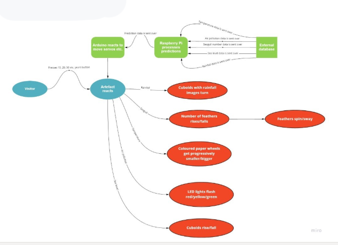
A data flow diagram (DFD) is a graphical way of showing how data flows through a system. It shows what types of data are needed within the system and the processes that said data must go through to achieve the ultimate goal. We found that the DFDs were a good way of understanding the datasets that that we had and how they could work together (i.e. breaking down a complex data system into smaller, easier to understand chunks that anyone would be able to understand at a top level). On this project, a number of different drafts of DFDs were created as the project progressed. These allowed the team to see what data there was to work with, where it was coming from and how it potentially could be represented on the data physicalisation.
DFD Draft 1 highlights in a generic fashion the data source and how it flows through the system.